
Teladoc Health / A more connected care experience
Making complicated care feel more connected.
Bringing a broader healthcare brand into the details of a digital product.
Brand to product · UX · Visual systems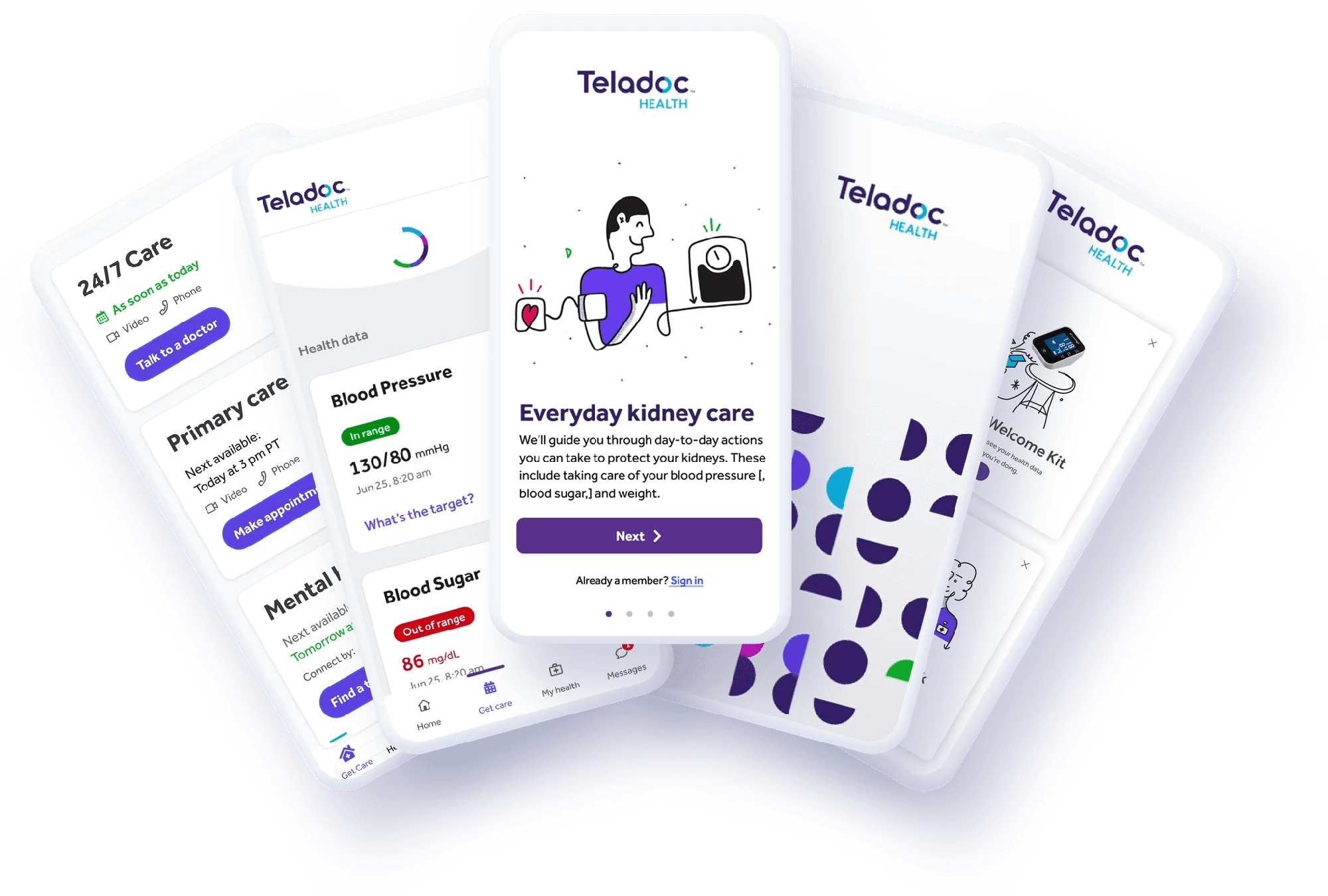 TELADOC HEALTH / PROJECT ONEAPP
01The problem
After multiple acquisitions, Teladoc needed to bring a fragmented healthcare ecosystem into a more cohesive experience. The evolving brand had to work in real product moments, where clarity and trust matter.
02What I saw
A consistent experience comes from the small things too: how a care card shows priority, how an icon reads, and how a product signals that something is happening.
03The idea
Translate the brand into practical product patterns. Make the details clearer for people and more consistent for the teams building them.
04 / What I made
Clarity in the details.
I contributed to Project OneApp through brand expression, component and interaction audits, an icon system, motion guidance, and illustration exploration. The work included clearer allergy-card hierarchy and feedback patterns.
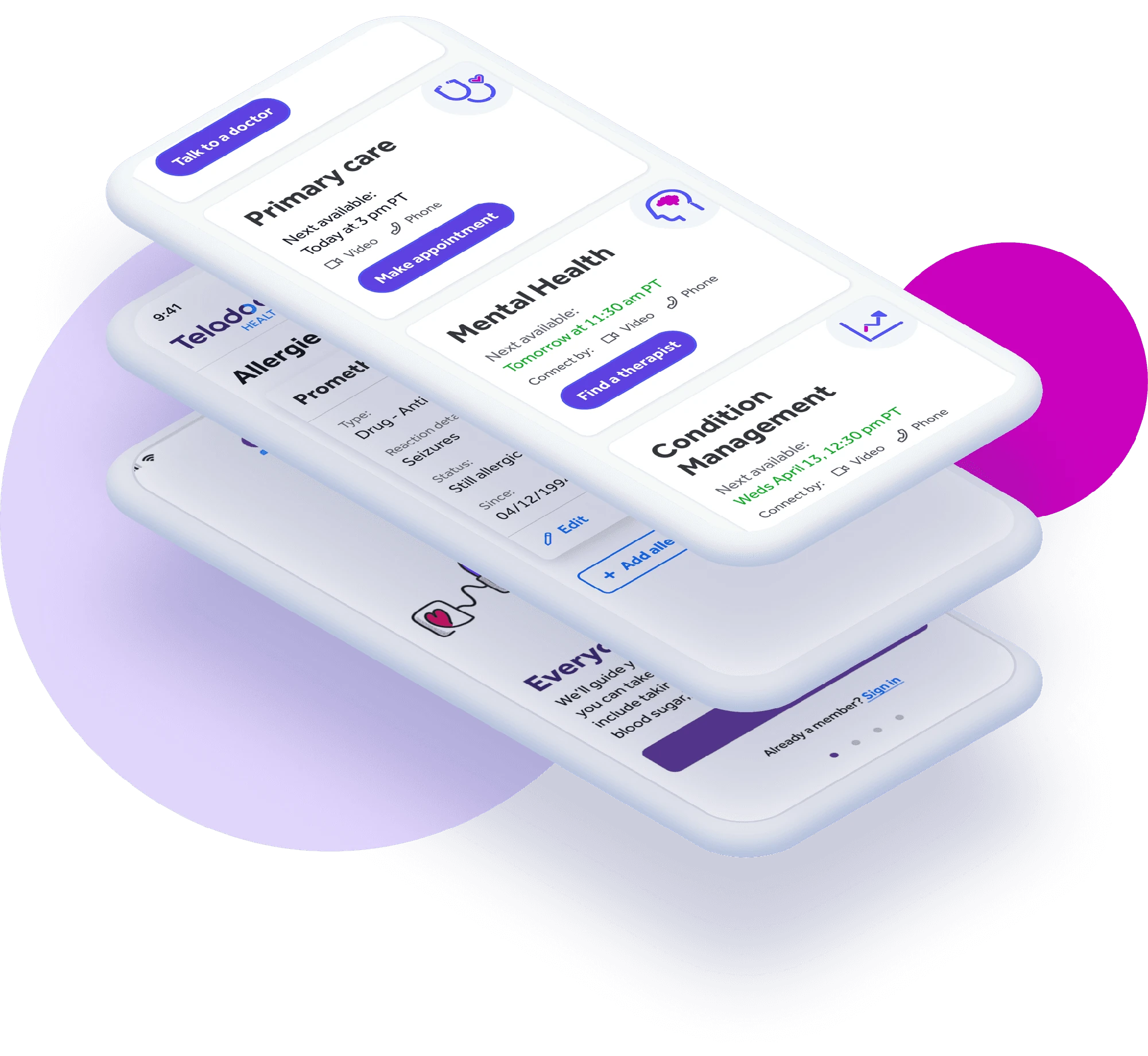
Product work from Teladoc’s Project OneApp. Created within a wider healthcare product and brand team.
05What changed
The work established a more cohesive visual and interaction language for a complex care experience. Accessibility informed the decisions, including contrast checks for icons. No clinical or business-impact metric is claimed here.
06My role
My contribution focused on product craft and systems within the wider team. I explored illustration directions and sketches; an independent illustrator created the polished production illustrations.
The customer app
A good place to start
Got something you’re
trying to figure out?
Tell me about the business, the idea, the weird problem, or the thing that could be better.
Tell me what you’re working on